

Spectrum app update
Spectrum is a market-first app designed to help young LGBTIQ+ find safe spaces & understand what it means to be queer.
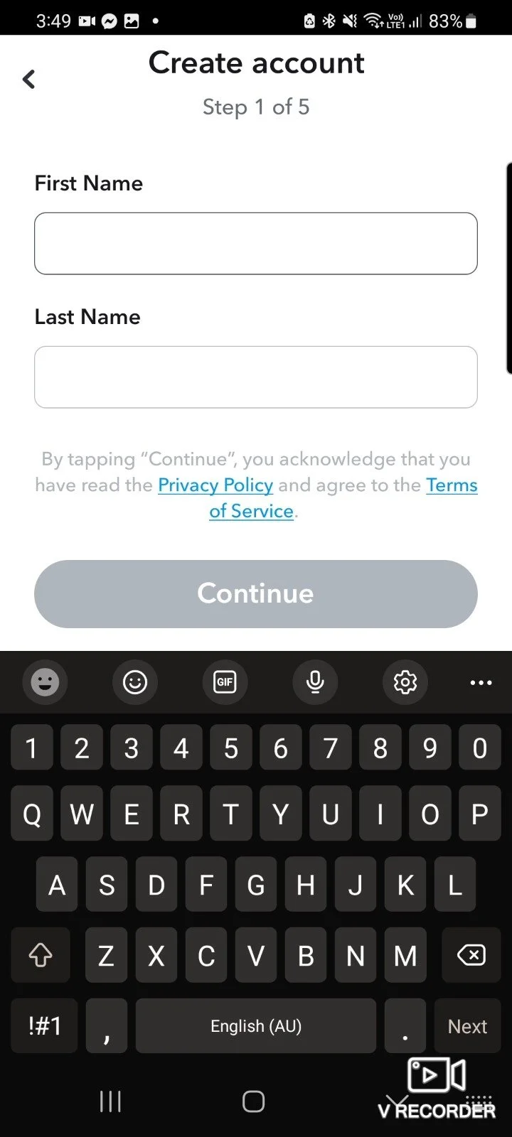
I joined the team as a freelance UX designer with a primary responsibility to enhance the onboarding process. Upon discussions with Matt, the founder, it was identified that the existing signup experience for customers was perceived as time-consuming, featuring an excessive number of pages. My role involves optimizing and streamlining this process to improve user efficiency and overall satisfaction.
research:
I initiated the project by conducting extensive research on applications with map-based functionalities, focusing on prominent examples such as Airbnb, Snapchat, and Waze. I utilized a dummy account to systematically record the sign-up process for each app. During this process, I meticulously documented the required information, the sequence of steps, and the overall time investment.
The common signup methods across these applications included options such as Gmail, Facebook or a conventional registration process. I engaged with the standard registration process, wherein users were prompted to provide a unique username, email address, date of birth, password, and phone number. This comprehensive analysis serves as a foundation for optimizing our app’s user registration experience.

Waze Signup
Snapchat Signup
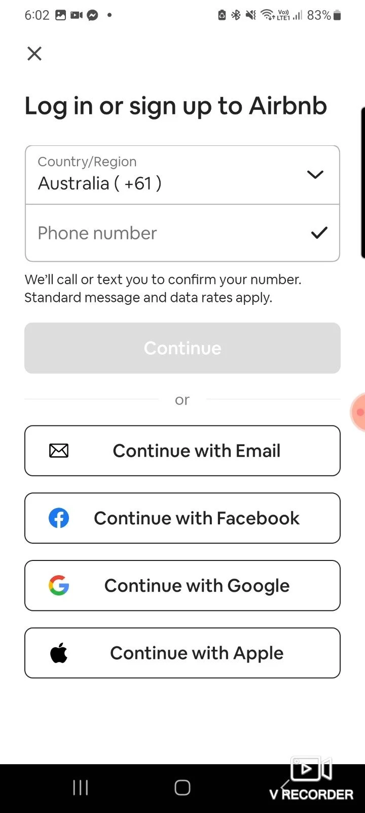
Airbnb Signup
designs:

Below is the updated notes and why these new changes would work:
The total amount of pages required to complete the sign-up process. This allows users to be aware of the overall length of the sign-up experience and helps set their expectations accordingly.
Date of birth is collected to provide additional demographic information that can be utilized for user research and analysis, ensuring a better understanding of the user base.
A phone number will be requested as part of the registration process. When comparing phone verification methods to traditional email verification, it is noted that a mobile number serves as a much more unique identifier for users. This approach eliminates the need for users to open their email accounts and ensures that sync settings are not an obstacle. (It may be necessary to conduct further research on this topic.)
Users will be prompted to create a password and then retype it for confirmation on the same page. If the passwords entered do not match, an error message will appear to assist users in correcting the information provided.
results:
A robust single sign-on solution was successfully implemented within the system, resulting in a significant and measurable reduction of user login time by an impressive 50%. This meaningful improvement not only streamlined the often cumbersome login process but also contributed to a noticeable enhancement in overall user satisfaction scores, which increased by a notable 20% as a direct result of this change.
badges
My secondary task involved the thoughtful conceptualization and intricate design of badges specifically intended for various locations. These meticulously crafted badges serve the primary purpose of highlighting significant aspects of the locations, with a particular emphasis on affirming that the location is an inclusive and safe space for the LGBTQ+ community.
This meaningful initiative seeks to visually communicate a welcoming and supportive environment through the strategic implementation of badge design, effectively conveying an atmosphere of acceptance and safety.

mock ups:
Badge Placement
Badge on Location
During the design process for the badge placements, careful consideration was given to the dimensions of the badges on a user’s mobile device. Ensuring optimal visibility and user experience, I accounted for appropriate sizing.
Badge Description
Moreover, I incorporated ample spacing to accommodate potential future additions of badges, maintaining a scalable and adaptable design framework. This approach aims to uphold a polished and user-friendly presentation while allowing for future enhancements.